
In this article, I will be exploring the data from the Metro Bike Share system in Los Angeles. From this page I downloaded the trip data from 2021 Q4 (October -December) and bike station information from Station Table.
The data containes the following fields:
| Trip Data |
|
Station Data |
| trip_id |
end_station |
station_id |
| duration |
end_lat |
station_name |
| start_time |
end_lon |
go_live_date |
| end_time |
bike_id |
region |
| start_station |
plan_duration |
status |
| start_lat |
trip_route_category |
|
| start_lon |
passholder_type |
|
| bike_type |
|
|
Data Cleaning
Before digging in, I always spend some time understanding how the data is laid out and look out for any duplicate or irrelevant data. I cleaned and filtered the data using EXCEL before importing it into PostgreSQL. I made the following changes in EXCEL:
- Removed plan_duration column from the data as passholder_type provided the same information
- Filtered for and removed all stations with the status ‘inactive’ to save space when uploading data to tableau for visualization.
This left me with the following summary values:
- 62,624 trips
- 217 active bike stations
- 1,309 unique bikes
To view the SQL code and other images associated with this report visit:
sjphilippe github
Stakeholder Questions
I structured my analysis to describe the data from 3 perspectives that bike share stakeholders would be interested in: user data, station data, and bike data. Visualizations were created using Tableau.
User Questions:
- How many active users were their between October- December?
- What is the ratio of rider pass type?
- What is the average duration of trips per rider pass type?
Station Questions:
- How many active stations are in each region?
- What are the 10 top most popular stations?
Bike Questions:
- How many of each bike type are currently in rotation?
- How many trips were taken by each type of type?
- What was the number of trips taken by the most ridden bike? How long was it used for?
- Which station did the most popular bike frequently dock at?
User Analysis
For user analysis I wanted to understand how different rider passes used the Metro service. This included: ratios of pass type, the average durations bikes were used for and how bike usage fluctuated over time. The SQL code to extract this info is seen below:
Select pass_holder,
	Count(Distinct trip_id) As pass_holder_trips,
	Avg(duration) avg_duration
From metro_trips
Group by pass_holder
Order by pass_holder_trips
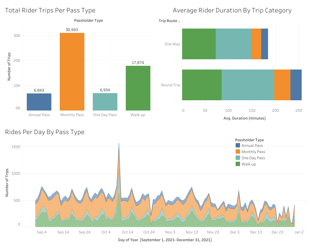
LA Metro Bike Share categorizes its riders via passes. There are four distinct pass types:
- Walk-Ups (single ride access)
- One-day Pass
- Monthly Pass
- Annual Pass
At the time this data was pulled, Metro Bike Share hosted a total of 62,644 riders. Monthly riders dominated bike usage with a total of 30,993 riders, followed by walkups, annual pass and one day passes. One day pass riders accounted for the greatest duration of bike usage with an average ride time of 75 min for one-way trips and 112 minutes for round trips.
A notable increase in riders was seen on October 10, 2021 which correlated with the CICLAVIA Heart of LA event. This event closed several miles of street in the center of LA to allow for pedestrian traffic on roadways. The jump in riders was most noticeable in walkup passes and one day passes. Walkup passes increased by 344 rides (112% increase) and one day pass increased by 312 (300% increase) compared to the previous day.
Station Analysis
For this analysis I focused on station popularity. Station popularity was determined by how many riders ended their rides at a particular location. To do this I joined both the metro trips and station tables. I excluded virtual stations from the query to better compare physical locations only. See query below:
Select Distinct ms.station_name,
	region,
	Count(trip_id) As trips_traveled
From metro_trips As mt
Join metro_stations As ms
On mt.end_station = ms.station_id
Where station_name <> 'Virtual Station'
Group by ms.station_name, region
Order by trips_traveled DESC
Limit 10
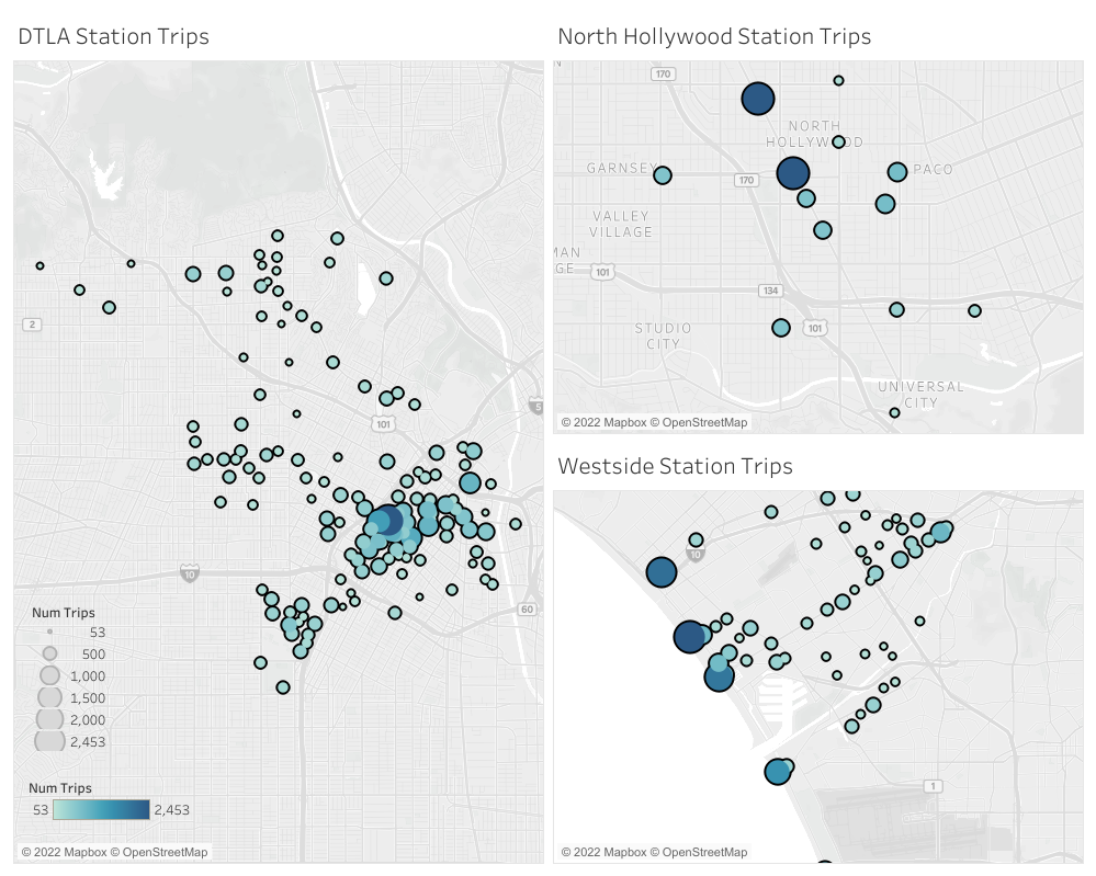
There are 217 active stations spanning 3 regions in the Los Angeles area:
139 in Down Town Los Angeles (DTLA)
23 in North Hollywood
55 in Westside
Out of these 217 stations, the 3 most popular stations were:
- Downtown Santa Monica E Line station in the Westside region with 2,832
- Ocean Front Walk in the Westside region with 2,306.
- 7th and Flower in the DTLA region with 2,090 trips
The below images show the density of trips to each station in their respected region. The larger and darker stations had the most riders
Bike Analysis
For bike analysis, I focused on frequency of use. This included which bike type was used the most and which bike had the most trips. See query below:
Select bike_type, Count(distinct trip_id) As num_trips_taken
From metro_trips
Group by bike_type
Order by num_trips_taken DESC;

Select bike_id,
	bike_type,
	Max(duration),
	Count(trip_id) As num_of_trips
From metro_trips
Group by bike_id, bike_type
Order by num_of_trips DESC
I also went one step further to see which station the most popular bike visited. See query below:
Select station_name, Count(trip_id) As num_visits
From metro_trips As mt
Join metro_stations As ms
On mt.end_station = ms.station_id
Where bike_id = 16837
Group by station_name
Order by num_visits DESC
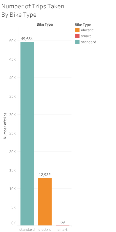
There are 1,309 bikes in rotation:
- 1,215 standard
- 71 electric
- 23 smart
Although standard bikes account for the majority of trips taken (49,654 of 62,647 trips), electric bikes are by far the most favored bike type. The **top 20 most popular bikes are all listed as electric, averaging over 100+ rides.
Bike id 16837 was the most used bike, with 343 trips total. For comparison, the most popular standard bike was used for 149 trips, and the most popular smart bike was used just 9 times.
Bike id 16837’s most frequented end station was 7th and Flower in the DTLA region for a total of 32 trips.
Conclusion
This is my first analytic project and I truly enjoyed the challenge of extracting meaningful information from the dataset. I plan to revisit this project in the future as a comparison to showcase my increased knowledge in visualizations, analysis and SQL. Some things I would like to add:
- Proximity of stations to popular restaurants (like boba tea) or destinations (beaches, parks…)
- Analysis of bike usage around major holidays or events
- Changes in station usage from initial activation.
- More complex SQL queries to demonstrate better manipulation of data
- Grouped visualizations to effectively illustrate trends for stakeholders
- The story of one bike travels
To view the SQL code and other images associated with this report visit:
sjphilippe github